Team GB x NatWest
Client
NatWest – NatWest Rooster Money
Industry
Banking
Role
Creative Director, Designer, Animation
Use case
Marketing campaign
NatWest Rooster Money makes pocket money and chores fun, easy, and educational for children. The Rooster Money team hired me as a hands-on, creative director to conceptualise and execute their new partnership with Team GB and extend it to the subbrand of NatWest, NatWest Rooster Money.
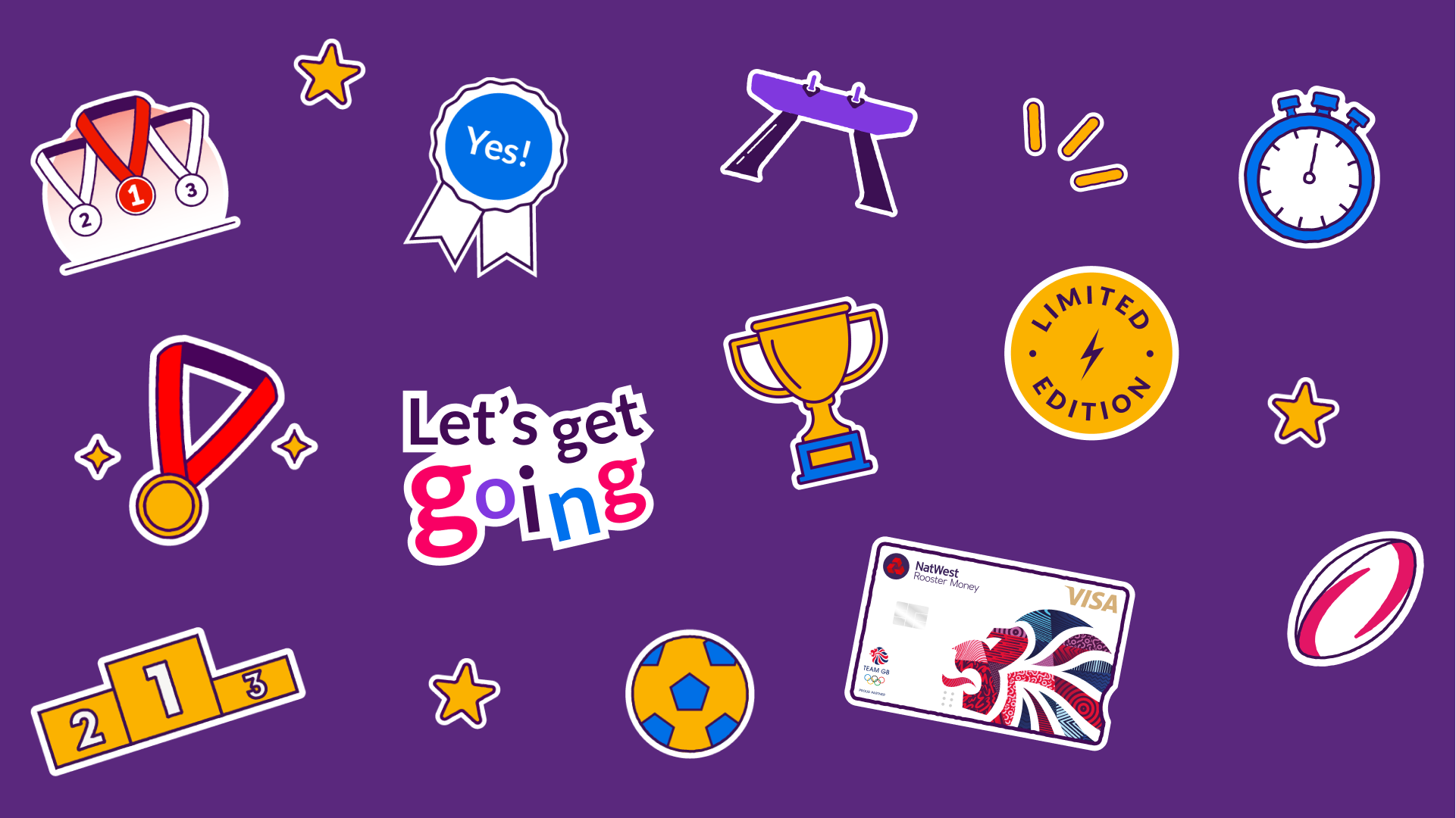
Stickers illustrations
The stickers became a very important element in the campaign. We needed a graphic element that was as different as NatWest’s adult audience, with a Rooster young tone but at the same time on brand. We created a pack of graphics that would be used across the campaign and by the marketing team in multiple channels.
The illustration style followed the style of NatWest brand illustrations, using a textured stroke and simplified colour palette of a maximum of two colours per illustration, with additional neutral or no-colour, identified as white or our champion purple brand colour.

The lock-up
The lock-up was the iconographic sign for the campaign. It evokes playfulness and action, encapsulating the spirit of the campaign. We made sure that the colour contrast pass the accessibility contrast frameworks so we could safely use it and be legible by our users across different digital channels.
Paid social ads: videos
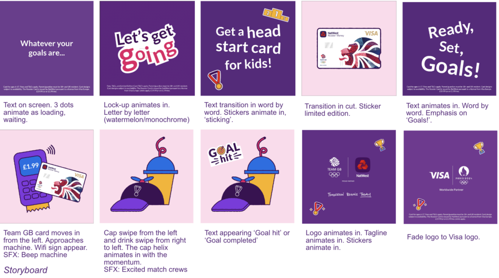
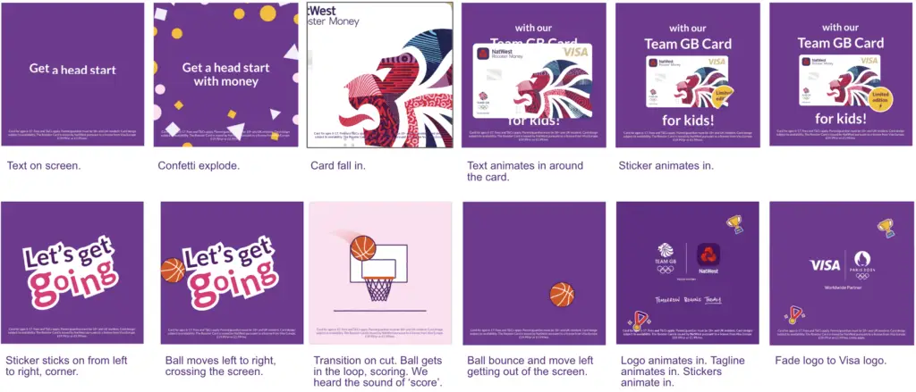
We created three paid social video advertising for Meta. We ideated, designed and crafted in-house.
Final videos
Storyboard


Draft animatic
Linkedin Instagram Dribbble© Sonia Vivo Design Ltd. / contact@soniavivo.com / @soniavivo_
