Seatfrog enables users to upgrade train tickets. I was hired as a Brand designer to help launch their new brand identity and introduce animation to their app, collaborating with their marketing and product teams.
Services UX motion design Graphic Design
Industry Rail, Travel
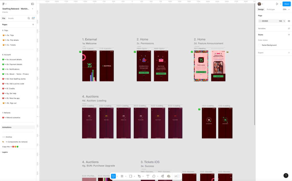
Animating Seatfrog's App: A Joyful Experience
Collaborating closely with the product team, I infused joy and personality into the app through engaging animations. Adhering to Google’s Material design principles, I crafted an intuitive and cohesive user experience. My animations were designed to be informative, focused, and expressive, bringing the app’s personality to life and guiding users effortlessly.
Logotype animation
The logotype mark becomes a playful mascot, guiding users and creating joy.
Splash screen
Depending on each screen’s content, the mascot shows excitement, worry or curiosity. For example, in the ‘splash screen’, the character shows enthusiasm since it’s welcome before embarking on the app.
Notification and subscription
Both animations intent to create curiosity and invite to subscribe or accept app’s notifications.
Loading screen
Auction screen
Subscribe pop-up
The mascot’s eyes are focused on the scene, the new update notification. Using a humorous tone, we invite users to be engaged and set a brand feel.
Development - Lottie Animation
The product animation was a collaboration with the product and engineering team.
After understanding the UX team’s goals for each screen. I first prototyped the animation, and after testing, I developed it with JSON Lottie. Some animations had segments which allowed the pace of the animation to be adjusted depending on the user’s interaction.
The animations were documented in Notion, along with the brand guidelines.